Rebrand
Solution:
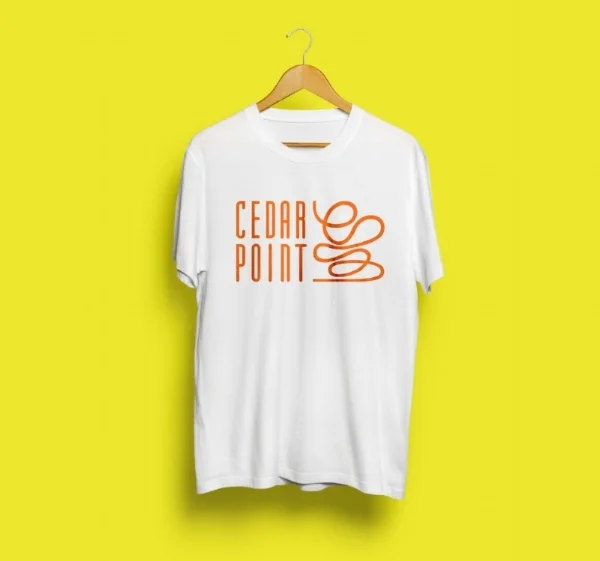
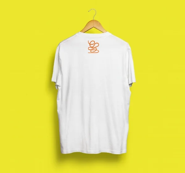
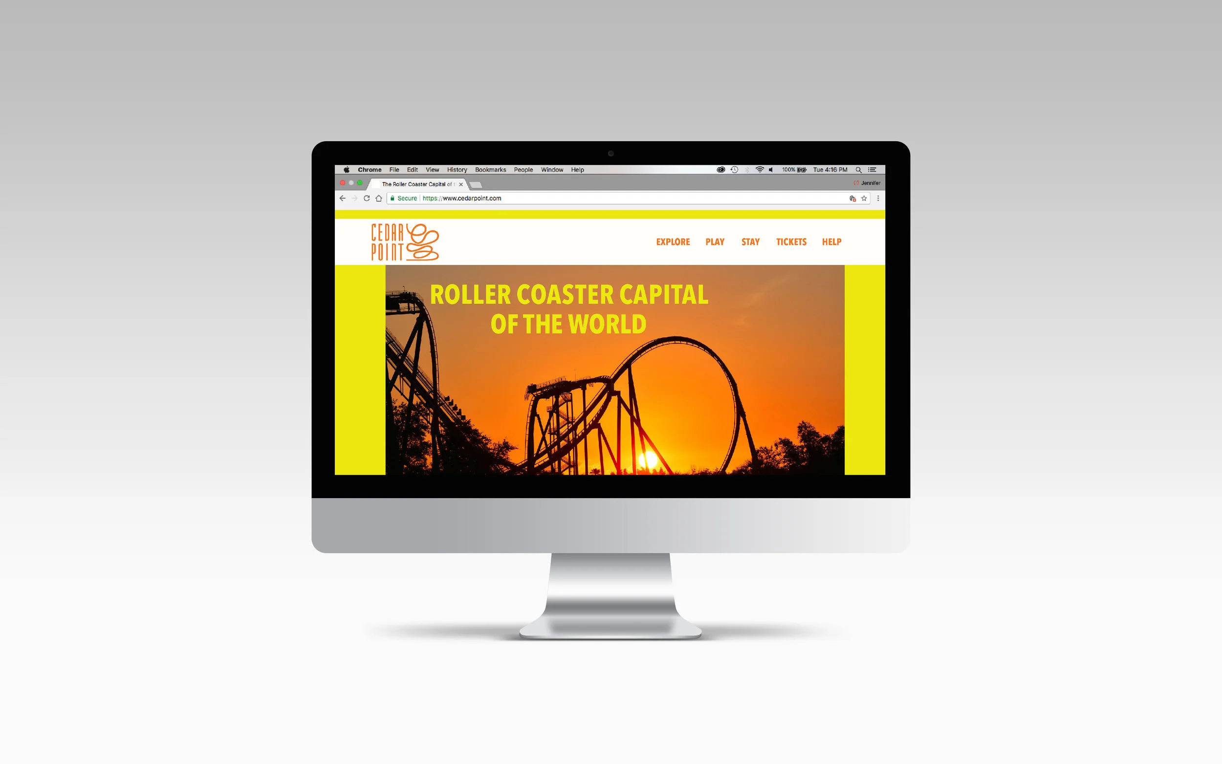
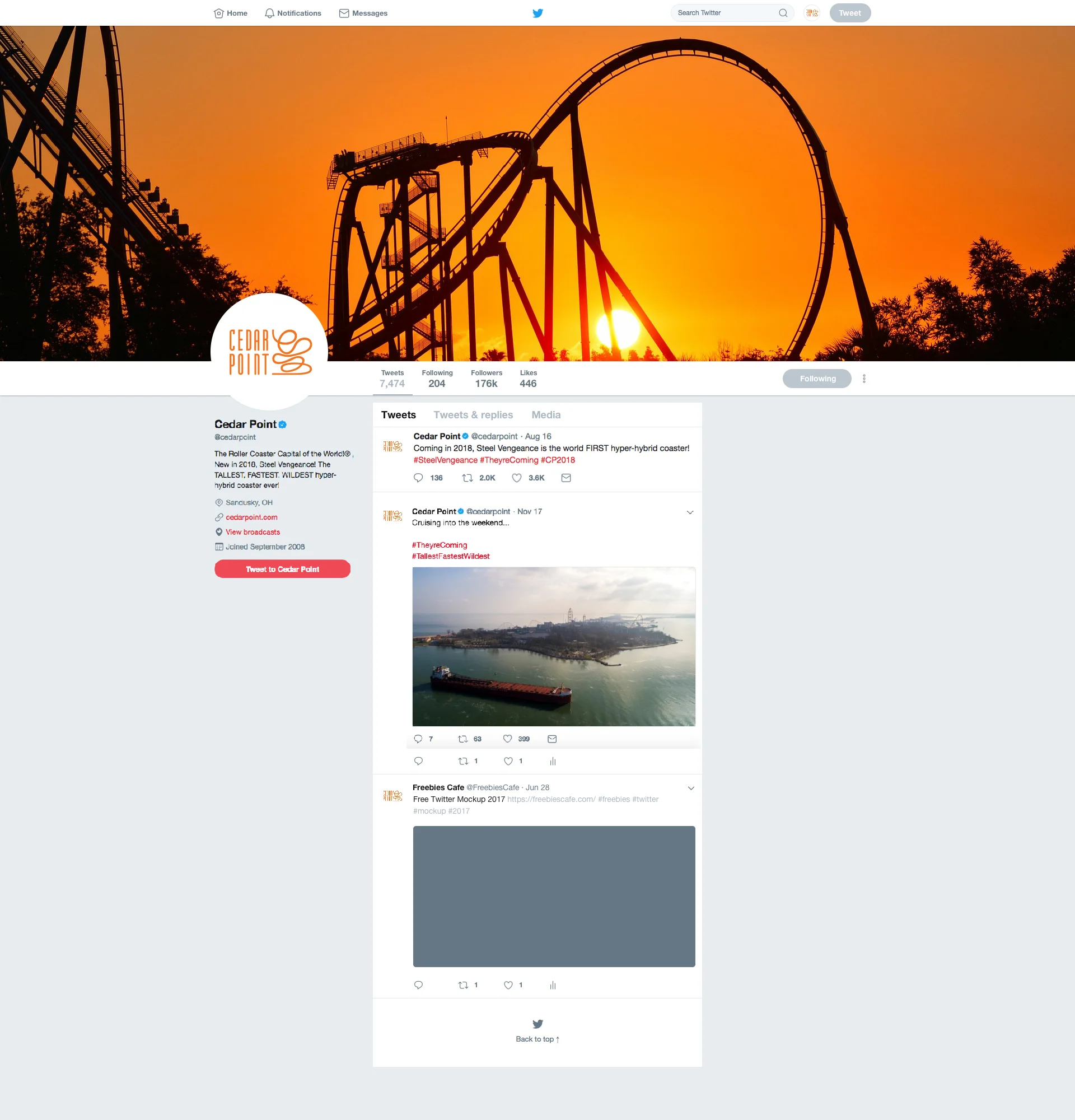
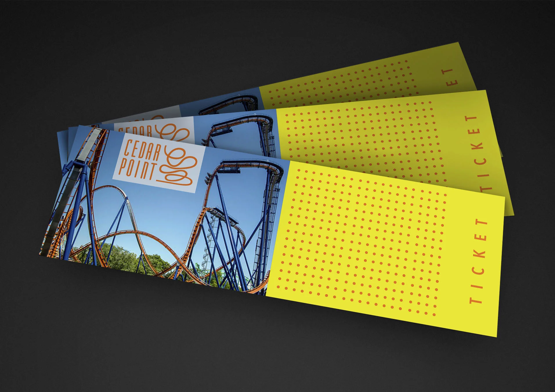
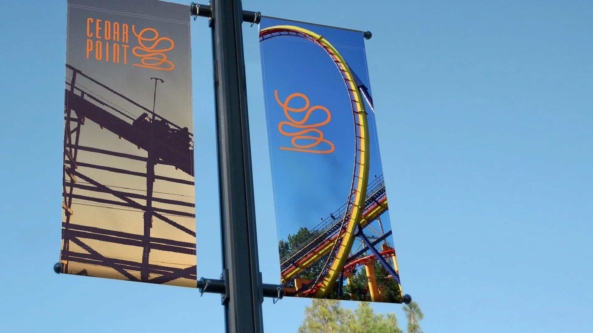
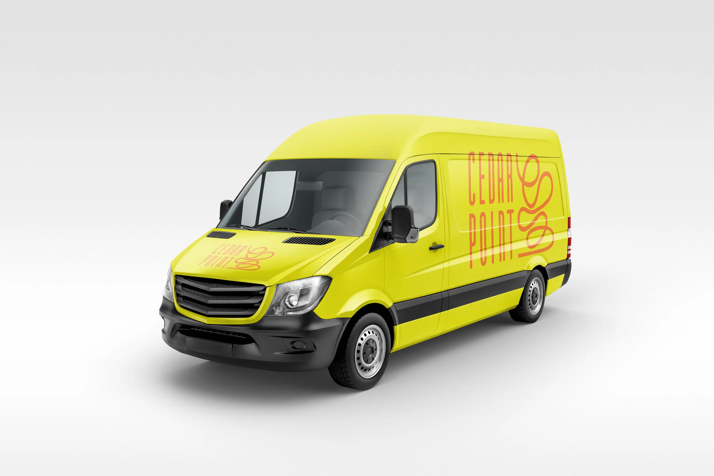
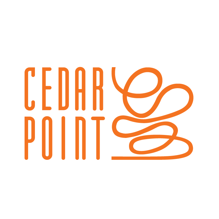
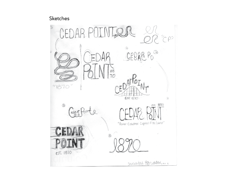
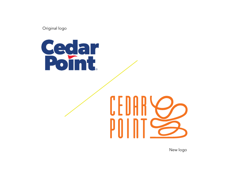
For the type I really wanted to get away from the basic san serif used in the current logo. I went with this super condensed tall round type to represent the first giant dip of a tall roller-coaster. I think it complements the mark with out overpowering it. The main color I went with is family friendly as well as thrill seeking.
Cedar Point: Concept rebranding project.
Problem:
Ohio based amusement park Cedar Point is the self proclaimed roller-coaster capital of the world. I think their current branding lacks excitement and fun, which is important for an amusement park to convey.
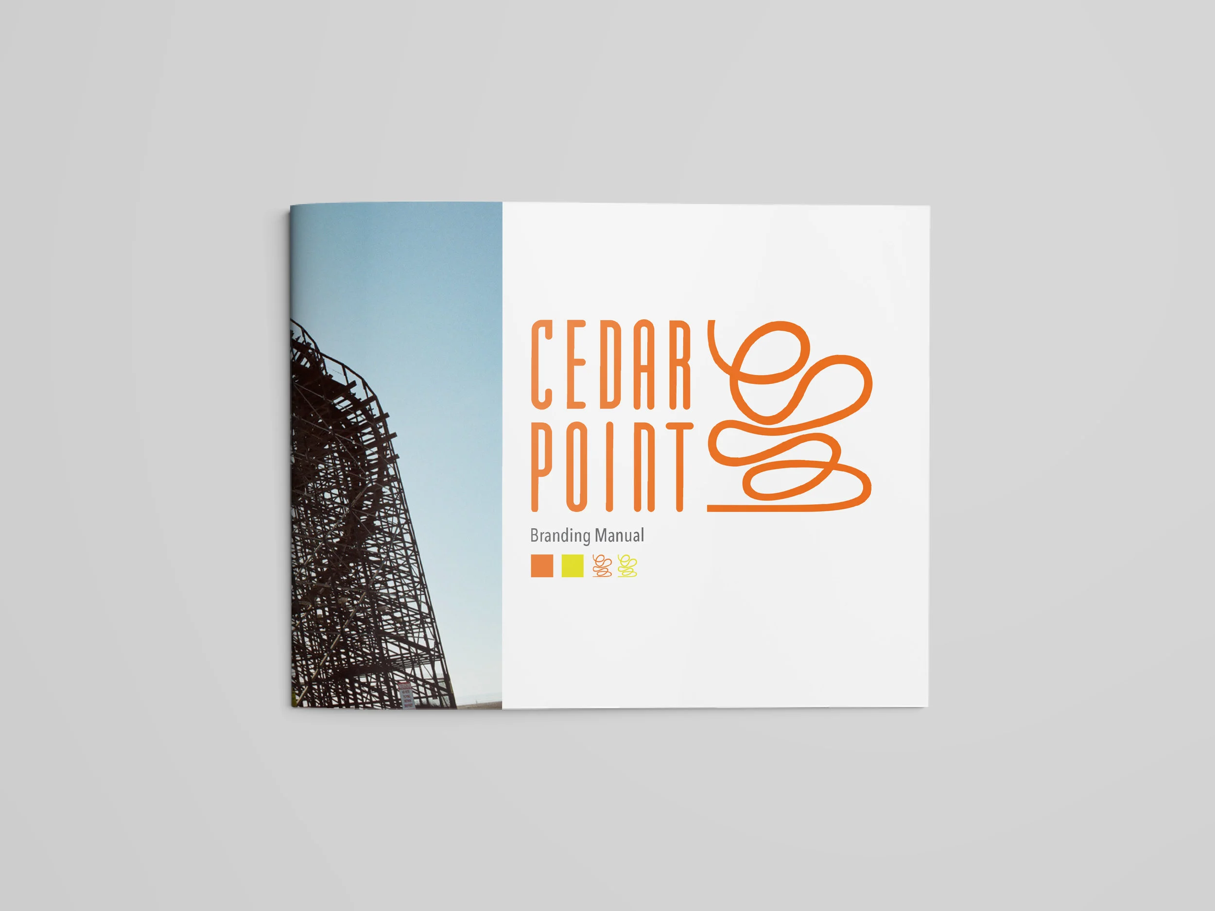
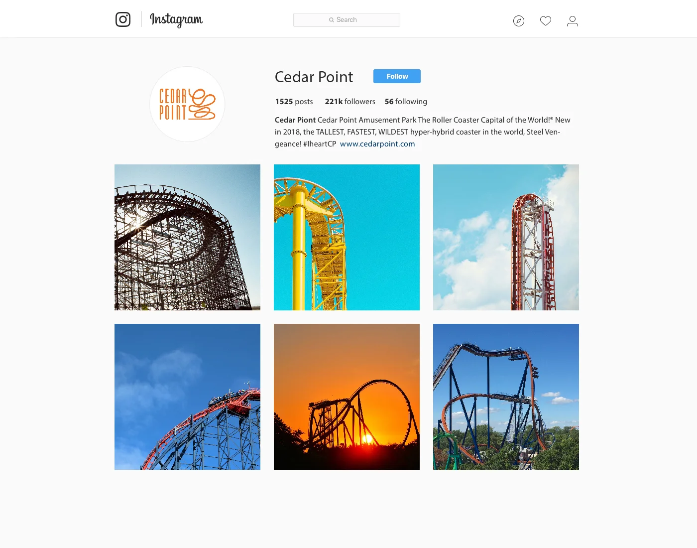
Applications